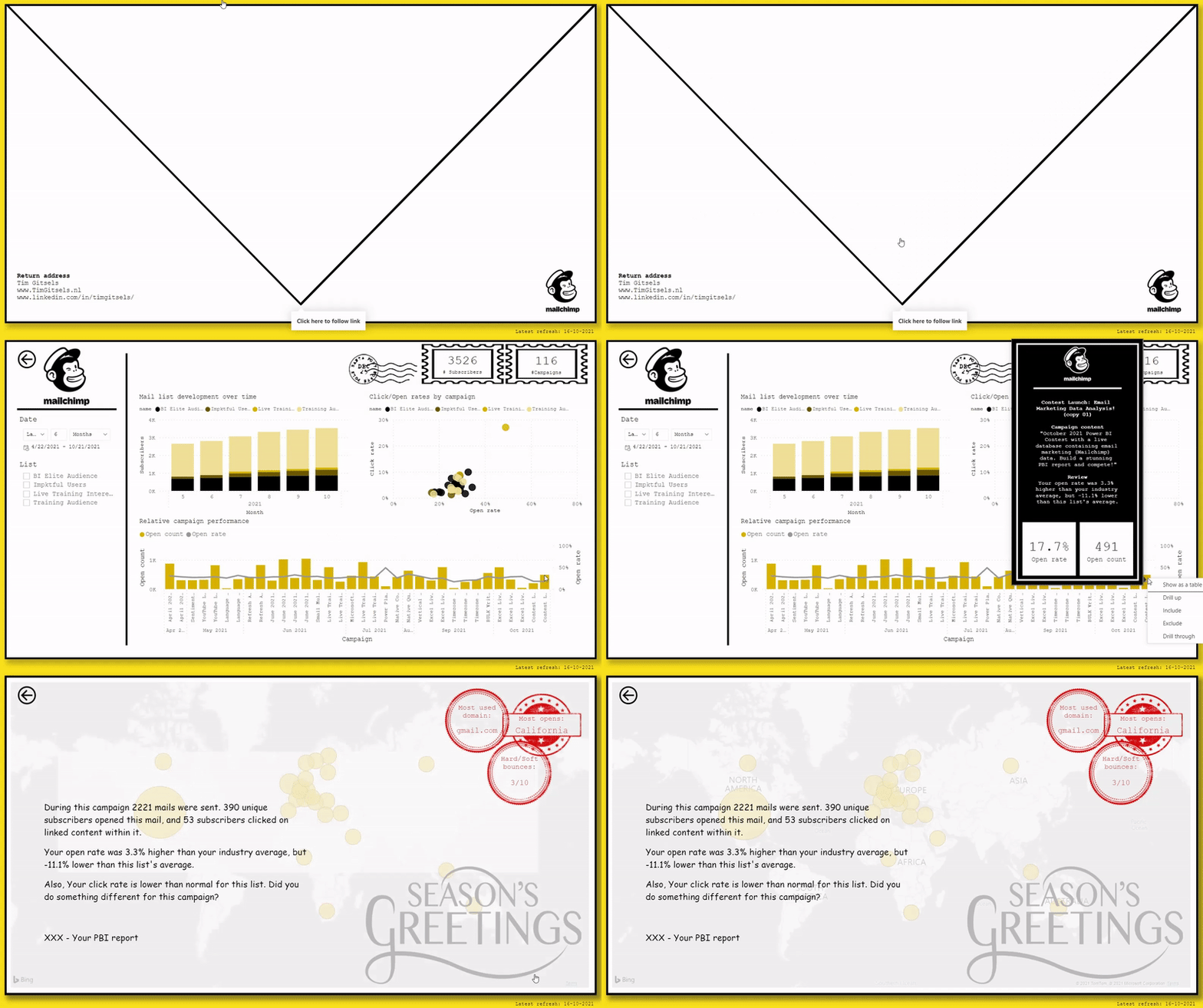
I recently came across a data visualization contest by BI Elite. The challenge was to create the best looking Report/dashboard based on a Mailchimp database. My interest was peaked so I went ahead and gave the contest a try! Below you will find my submission to the contest.
Update: My submission earned a winning spot in the contest! Check it out at BI Elite – Mailchimp contest winners.
Source: Real-World Dataset – Email Marketing | BI Elite Training

This is amazing. Any chance you’re willing to share the PBIX
Hi Tim, congrats on winning the BI Elite Marketing analysis challenge. As a PBI beginner, your report truly is inspirational! I really hope to be able to create a report that gives users an experience such as you provided through your report. Also, I’m curious about what fonts you used since they don’t look like the default ones. Thanks and have a great day ahead!
Hi Theeben,
Great to hear! Definitely join in on some of these contests as well if you’re getting started with PBI, it’s a great way to practice :).
Regarding the fonts, for this report I only used PBI native fonts (mostly ‘Courier new’) so you should be able to find it in the default list.
Looking forward to seeing some amazing reports by you as well in the future!
Regards,
Tim