Translating data into actionable insights for end-users can be tricky. You may understand the content of your dashboards and reports yourself, but the challenge is to communicate it in such a way that your audience can decipher it as well. Unfortunately, there is no universal ‘best’ report template that we can recycle for all reporting needs. However, there are plenty of tips and tricks to help you make your own designs more attractive and comprehendible to your audience. I’ve listed a few to get you started.
Get your story straight
Storytelling should be the starting point of your report. Take some time to consider what message you are actually trying to convey with your report, and who it is that your are trying to reach. The best visual choice will often depend on the story your are trying to tell, the audience you are trying to tell it to, and the message you want your story to bring across to your audience. Try answering the following questions when you start working on your next report/dashboard:
- What is the purpose of my report? (Story)
- Who will be consuming my report? (audience)
- What answers are my audience members looking for while reading my report? (Message)
Keep it simple
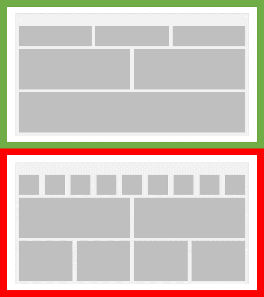
Reports and dashboards get crowded quickly. I get it, your data contains a lot of valuable insights, but a lot of this value is lost when users cannot fully absorb it. Cramming 10 KPI’s on the top of your report will likely mean that your audience’s attention span will have run out before actually paying attention to them all. I generally try to limit the number of visuals on a page to 4 / 6. This will challenge me to think about what the most important content is, and spares the end-user an information overload. Does your audience really require more information within a single report page? Then perhaps give bookmarks and tooltips a try first.
Easy on the eyes
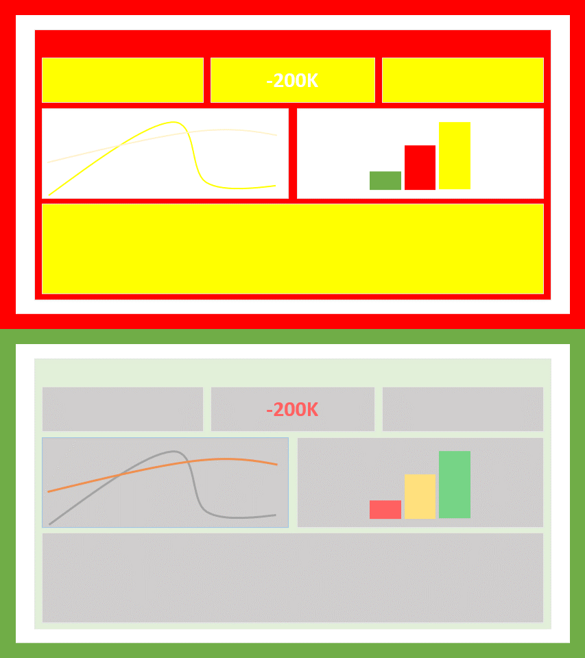
Colour is key if you want your audience to enjoy your content. Make sure to use contrasting colours (e.g. no bright yellows on a white background) and opt for pastels for most of your report colours. Save the saturated colours for when you really really want to direct attention to something. Use too many saturated colours and your Audience will need to start using sunglasses. Also make sure to use matching colours, and consider that your audience may have a natural association with certain colours (e.g. red = bad, green = good). If you’re lucky, your organization may already have a decent colour scheme you can use. If not, take a look at the Power BI theme gallery and automatic color scheme generators like Colormind for some inspiration.
Reading
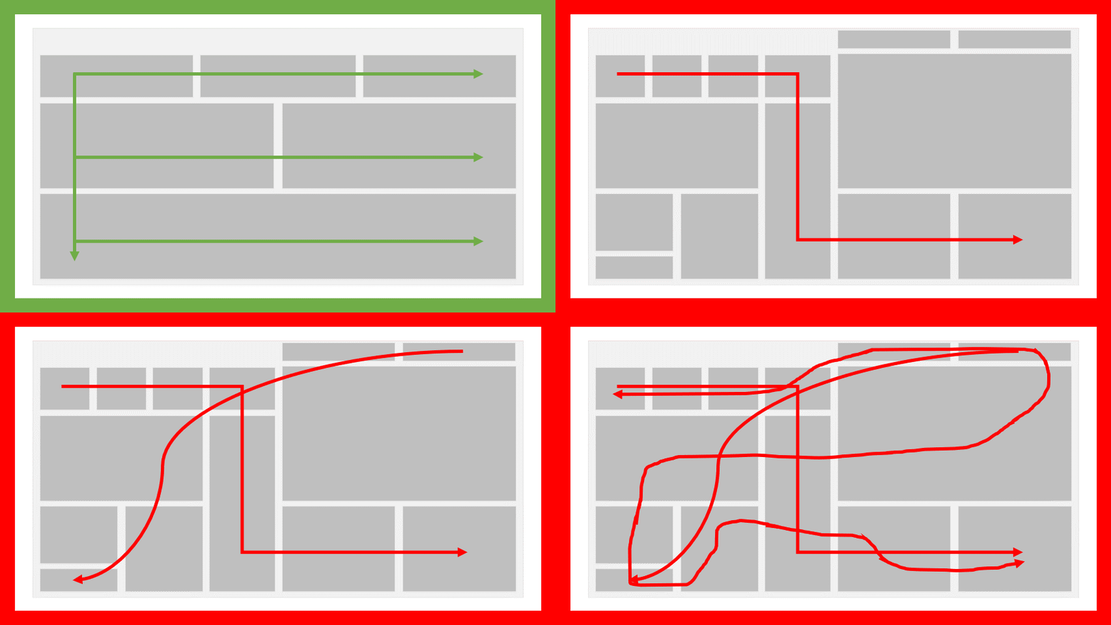
Based on their native language, your audience will have been taught to absorb information in a particular way. Most western languages, for example, are written from left to right and from top to bottom. therefore, If you would ask me to read a piece of paper, I will automatically focus my attention on the top left part first and then move right and down. This same behaviour applies as well to reports. To make life easier for your audience, try shaping your presented information in a way that matches the natural reading behaviour of your users.
Content grouping
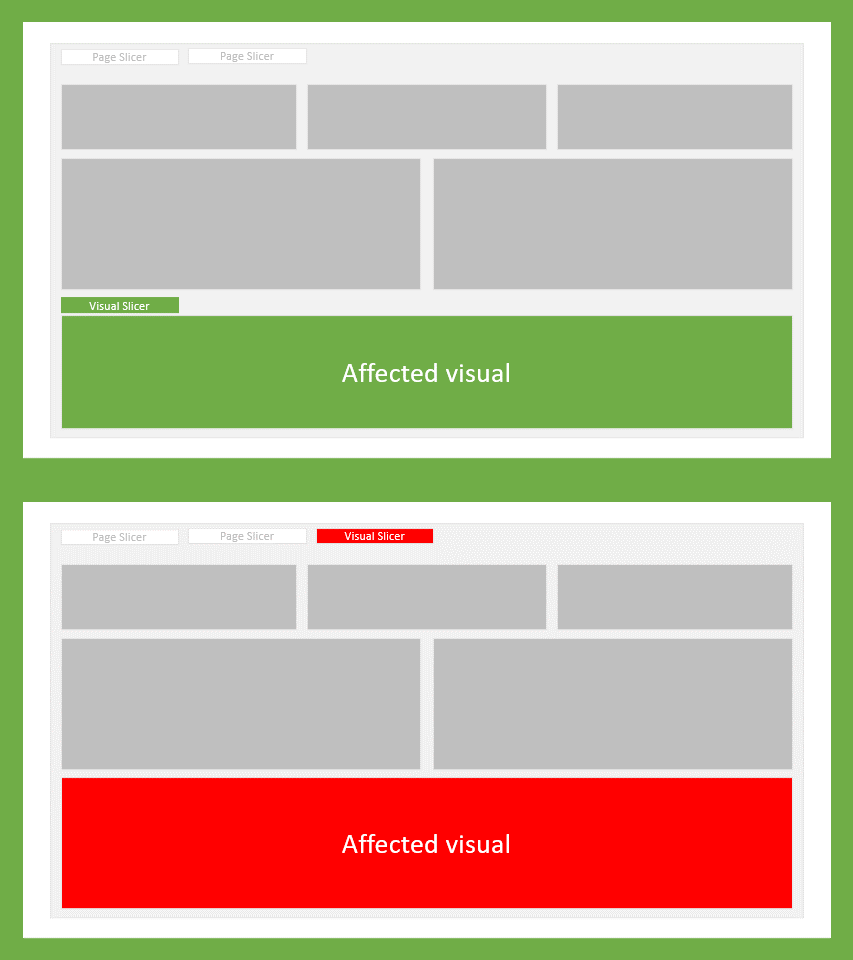
As the report designer you are probably well enough informed about which visuals and slicers do and don’t interact with each other. This may not be the case for your end-users. To avoid any confusion, Make sure you clearly identify which pieces of content belong together. For example, a Slicer that only influences a single visual on the page, should be located near that visual instead of in the slicer pane.
The right visual at the right place
To bring across your message, picking the right visual is essential. Take a look at the message your are trying to send, and the information you need to do so. Are you looking to inform your audience about the performance over the past few months, then you might want to pick a line chart. Does your CEO want to know whether the organization is currently meeting targets, then a KPI visual might suffice. Below you will find some examples of visuals that fit certain reporting needs.
| Messaging | Example visuals |
|---|---|
| I want to compare results | Clustered bar/column chart, Stacked bar/column chart |
| I want to Display a distribution of values | Box plot, Candle stick, Histogram |
| I want to rank categories | Bar/Column chart, Table/Matrix |
| I want to display spacial data | Filled map, H eatmap |
| I want to display a single value | KPI, Card |
| I want to display changes in data over time | Line chart, Gantt chart, KPI |
| I want to display a correlation between values | Scatter plot, Venn diagram, Correlation matrix |
| I want to display parts of a total | Clustered Bar/Column chart, Stacked bar/column chart, Area chart, Drill-down |
| I want to display a flow of data | Sankey chart, Funnel chart, Waterfall chart |
